 |
Having trouble viewing this e-mail? |
 |
Sentinel with Tungsten and Verlag |
Is there a way to know what fonts will work together? Building a palette is an intuitive process, but expanding a typographic duet to three, four, or even five voices can be daunting. Here are four tips for navigating the typographic ocean, all built around H&FJ's Highly Scientific First Principle of Combining Fonts: keep one thing consistent, and let one thing vary. |
 |
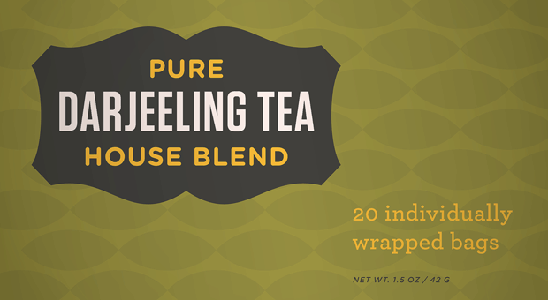 |
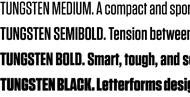
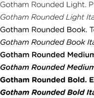
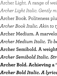
| It's the interplay between fonts that gives them energy. The more distant the moods in a typographic palette, the friskier the design will be. Here, three fonts with distinctive silhouettes have been chosen for their contrasting dispositions: the unabashed toughness of Tungsten is a foil for both Archer's sweetness, and the cheekiness of Gotham Rounded. |
 |
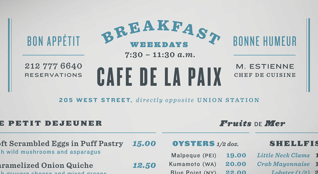 |
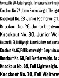
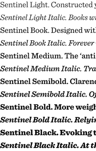
| Three type families with nineteenth century roots, thrown together in a cheerful typographic riot. Choosing type families with different features helps prevent redundancy: here, the brawny variations of The Proteus Project are reserved for headings, Sentinel's six weights of romans and italics recommend it to text, and Knockout's nine different widths helps the sans serif fill in the cracks. |
 |
 |
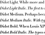
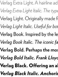
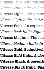
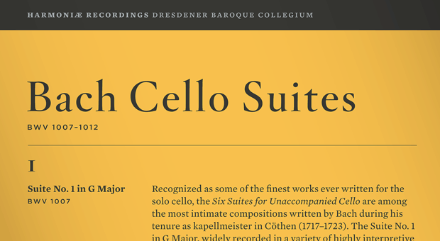
| What do a neoclassical modern, a suave sans serif, and a sporty slab have in common? All are meditations on precision, though each has a different texture. H&FJ Didot achieves its crispness through the thinnest possible serifs, Verlag through its insistently geometric motifs, and our new Vitesse typeface through its pairing of machined edges and racy curves. Together, these three mechanical faces create a dramatic typographical tension. |
 |
 |
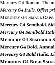
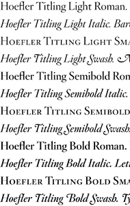
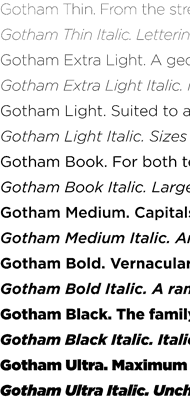
| A clever way to combine typefaces with similar proportions is to assign each a different purpose, and to limit each to a specific range of sizes. Here, two hard-working typefaces are assigned supporting roles: the seriffed Mercury serves for text, and the sans serif Gotham furnishes all the annotations. The star of the show is the sophisticated Hoefler Titling, which preserves its spotlight by appearing only occasionally, and always in large sizes. |
| You're receiving this e-mail either because you're a customer of H&FJ, or because you've created an account on our website, www.typography.com. We don't e-mail often, but if you'd rather not hear from us at all, you can simply click here to unsubscribe the address *|EMAIL|* from our list. Copyright © 2010 Hoefler & Frere-Jones. 611 Broadway, New York, NY 10012-2608. Archer, Gotham, Gotham Rounded, H&FJ Didot, Hoefler Titling, Knockout, Mercury Text, Proteus Project, Sentinel, Tungsten, Verlag, Vitesse, and Whitney are trademarks of H&FJ, which may be registered in certain jurisdictions. Prices are subject to change without notice. All rights reserved. |
|