|
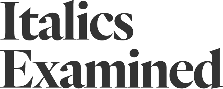
Often the most colorful part of a type family, italics can diverge dramatically from their roman cousins. Now on typography.com, a look at twelve species of italic letterform, with notes on their culture, history, and practical application. Read more.
|
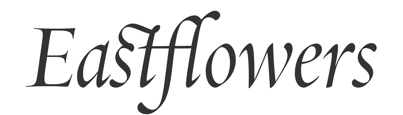
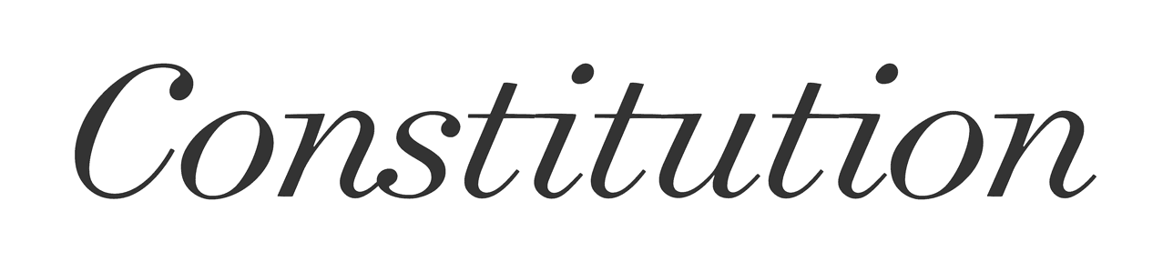
To some calligraphers, the finest cursive letters were those made at the very dawn of typography, in the style known as the Chancery Italic. These letters have long signaled magnificence, expressing the joy of a wedding invitation or the pathos of a book of verse. Their long-limbed ascenders and descenders invite decoration, as in this font’s extended set of ligatures, created to elegantly resolve collisions between neighboring letters like the s–t–f–l, above.
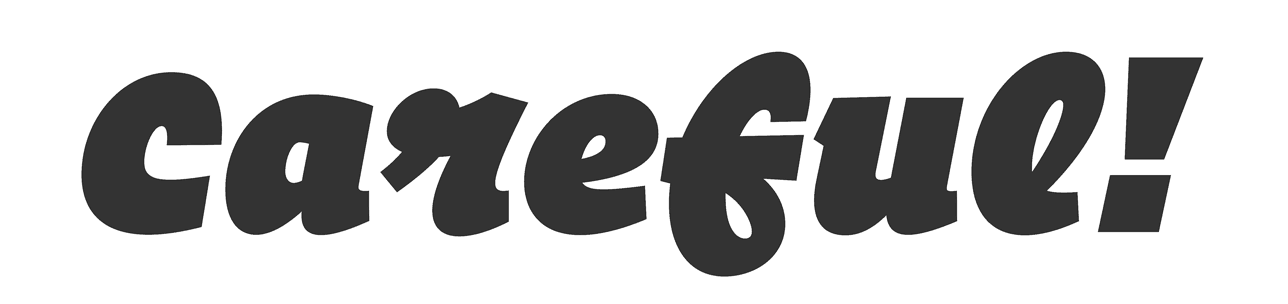
Many boisterous italics are made in a Postmodern style, freely borrowing from different genres. This design riffs on the various fixed-width letters found on typewriters, taking cues from both upright and script alphabets, and emerging with a usefully informal tone. This type family extends to nine different weights, with the extreme Thin and Ultra styles having especially distinctive personalities.
These sinewy letters in the English Vernacular style come not from the history of typefounding, but from map engraving, where they were traditionally used to label bodies of water. In place of serifs, they have long and fluid “exit trails” at the bottom, which help them follow curved baselines like the meandering paths of streams and coastlines.
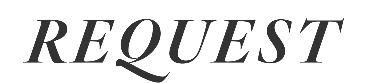
Typefaces in the Dutch Old Style manage to be dark and bright at the same time, like a rousing symphony in a minor key. An invention of the seventeenth century, when the airy types of the Garamond style gave way to a darker, northern European fashion, these faces are useful when typography needs both a dense color and a classical air — especially useful if display type will appear against a non-contrasting background.
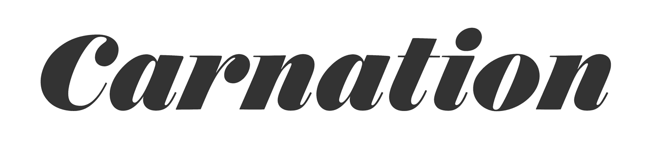
The arrival of the mass-produced poster gave rise to typography’s first large italics expressly designed to be eye-catching. These typefaces, unsurprisingly called Fat Faces, can be equally effective at sizes both large and small. This family features three optical masters for Text, Display, and Fine typography, sturdy enough to withstand small sizes, and delicate enough to thrive at large ones.
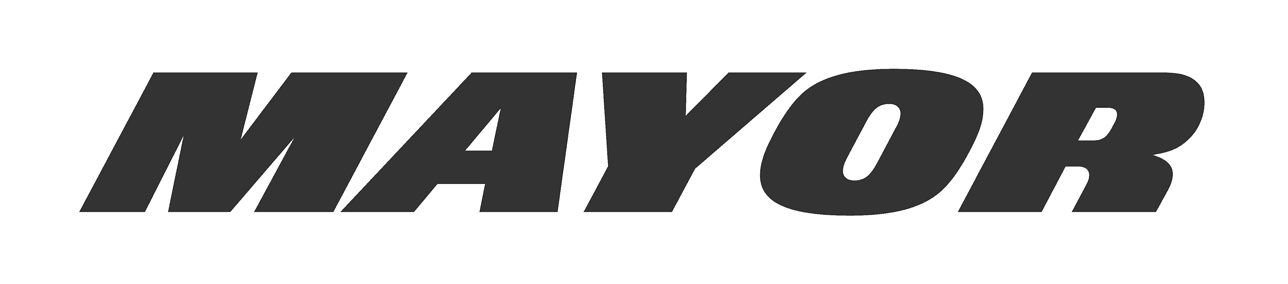
An italic’s angle shapes its personality. A font with a gentle slope of just six degrees can be lovely and lyrical; fifteen degrees and it’s positively brisk. This powerhouse Superitalic achieves its speed and urgency with a 28° slope, making it our most italic typeface ever. Useful in everything from political campaigns to motorsports, it’s a typeface that designers call upon whenever typography needs to communicate raw power.
|
|
This e-mail comes from Hoefler & Co., purveyors of H&Co fonts, webfonts via Cloud.typography, and App.typography. If you’d rather not receive our occasional e-mails, just click the link at the bottom of the e-mail you received that took you to this page to unsubscribe that e-mail address from our list. Copyright © 2016 Hoefler & Co., 611 Broadway, New York, NY 10012-2608. The names of the typefaces, software and services featured herein are trademarks of H&Co, which may be registered in certain jurisdictions. All rights reserved.
|