One of the telltale signs of a vintage watch is its lettering. The unique markings on watch dials, surprisingly consistent from one manufacturer to the next, evolved separately from typography: these are forms unconcerned with the needs of type designed for printing words on paper, and unmoved by the changing fashions of graphic design. Instead, watch lettering has been shaped by the curious technologies of dial manufacturing, the demanding requirements of working in miniature, and the unusual commercial arrangements that first gave rise to these remarkable inventions.
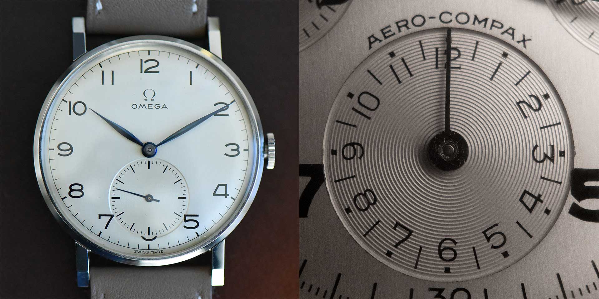
Watch lettering is printed through tampography, a technique in which ink is transferred first from an engraved plate to a spongy, dumpling-shaped silicone pad, and from there onto the convex dial of a watch. To reproduce clearly, a letterform needs to overcome the natural tendencies of liquid ink or enamel held in suspension: tiny serifs at the ends of strokes can create a larger coastline, to help prevent liquid from withdrawing due to surface tension; wide apexes on characters like 4 and A eliminate the acute angles where liquid tends to pool. In the two watches above, an Omega 30T2 (ref. 2186) and a Universal Genève Aero-Compax (ref. 22414), artists have taken different liberties with the figures 3 and 7, using different approaches to maximize the openness of these forms. But the peculiar figure 4 is identical, with a low crossbar and a wide apex designed to dilate the counter, defending clarity while producing a silhouette that balances comfortably the other numbers on the dial. How is it that two unrelated watches have the same figure four? How do nearly all vintage watches have it?
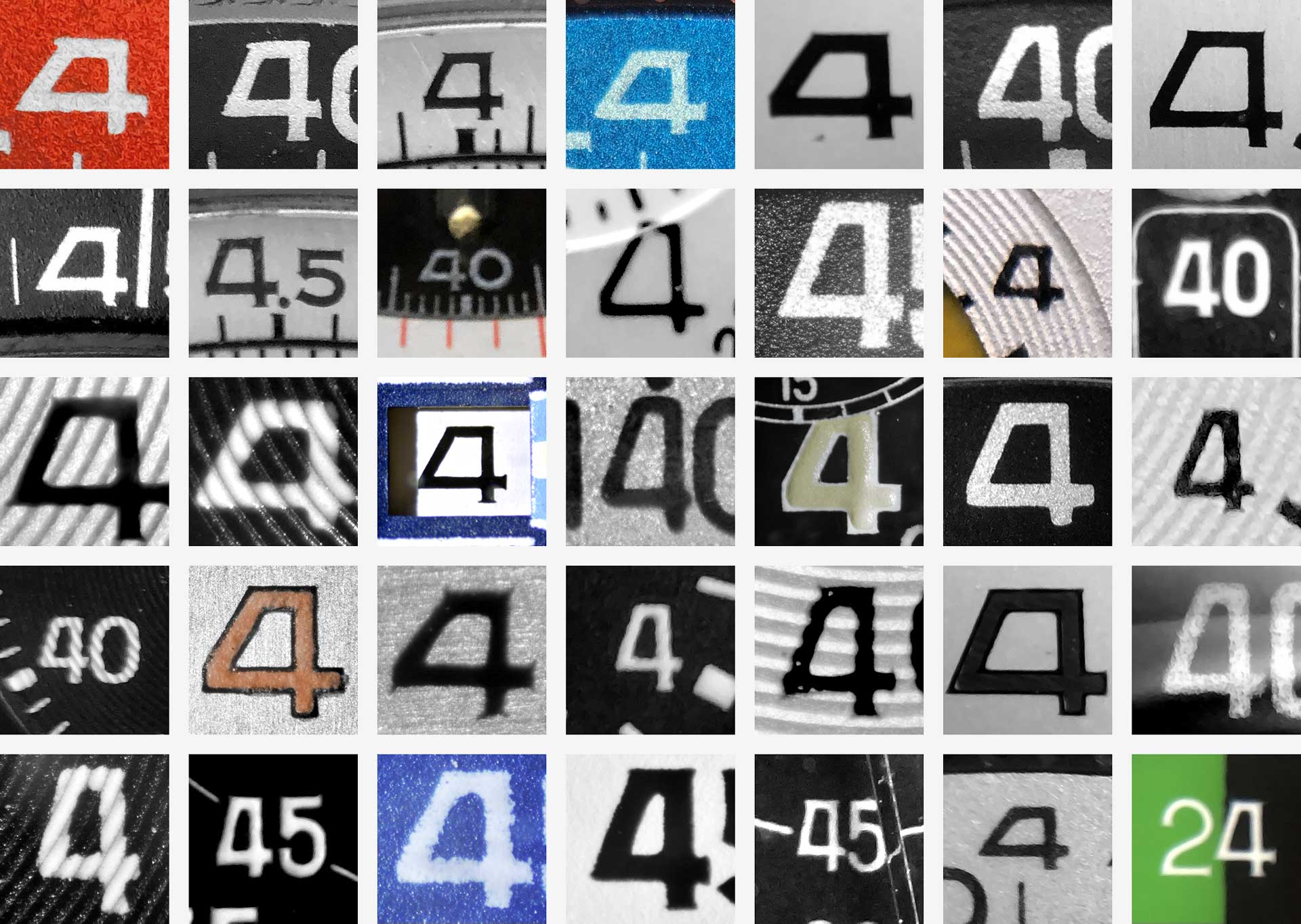
For all the sophistication of a mechanical movement, it’s the dial that may be the most complex part of a watch. Creating a single dial may require more than a hundred different operations, as well as the expertise to work with materials from stainless steel to mother-of-pearl (to gemstones, to feathers, to wood.) A dialmaker must know how to galvanize, electroplate, varnish, lacquer, paint, stamp, engrave, solder, and drill, and all in miniature. Dialmakers routinely maintain and operate multiple generations of the same technology, using a laser cutter in concert with a centuries-old rose engine, to create a particular guilloché pattern specified by a manufacturer. The niche skills and equipment needed by these workshops encouraged dialmakers to specialize long ago, and for most of the last century, the same small handful of prestigious dialmakers supplied watch dials to nearly all of the major manufacturers. Stern Créations, established in 1898, provided dials to Audemars Piguet, Vacheron Constantin, Patek Phillipe, and Cartier; Singer, founded in 1919, created them for Rolex, Omega, Heuer, and Universal Genève. For all the ways in which watch lettering was a natural response to the measurable needs of the medium, it was also the product of a relatively small number of artisans, whose hands shaped the aesthetic of the entire industry. The wide-topped 4, the sharp-centered M, and the bulldog stance of the short-limbed R and K were among their mannerisms, a seamless blend of mechanical problem-solving and artistic intuition.
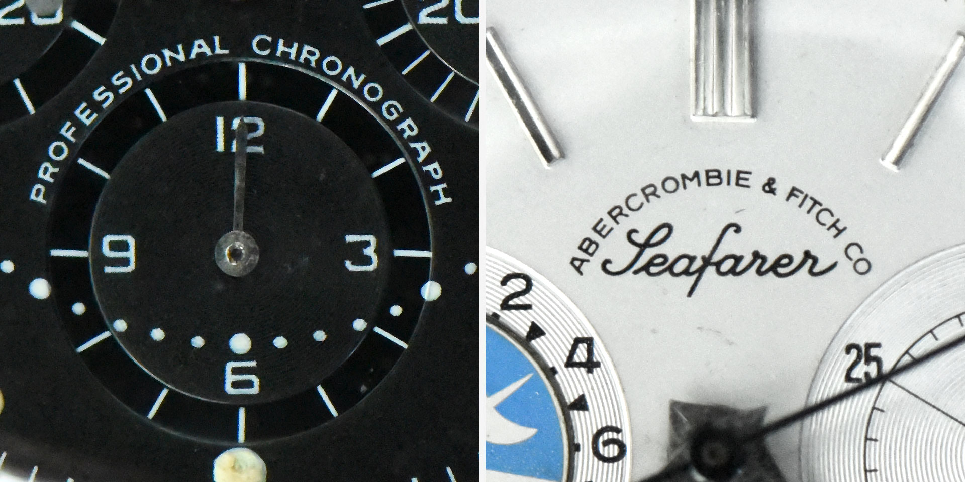
Some signature gestures of the watchmakers’ alphabet were innovations that evolved to suit new technological features. The broad swing of the letter J, uncharacteristically topped by a serif, helps to make the letter wider, ensuring that narrow-lettered months like jul and wide-lettered ones like mar will occupy the same space on a calendar wheel. Elsewhere on a watch, alphabets are usually smaller, relegated to marking the scale of a tachymeter or telemeter, or identifying a watch as a chronograph or chronometer. The Swiss domination of the industry ensures the letters S and W on most dials (useful bellwethers for the typeface designer) but here the material ends. Few watches ever included lowercase or italics, save the occasional Km on a telemeter dial, or water resistance indicated in ft or m; punctuation beyond periods and ampersands is similarly absent. But even among the realm of garden-variety capitals, every watch reveals inherent contradictions and short-sighted decisions that limit the potential for a truly authentic typographic revival of the style, guaranteeing early that Decimal would be an interpretation and a celebration of the style, but not a replica.
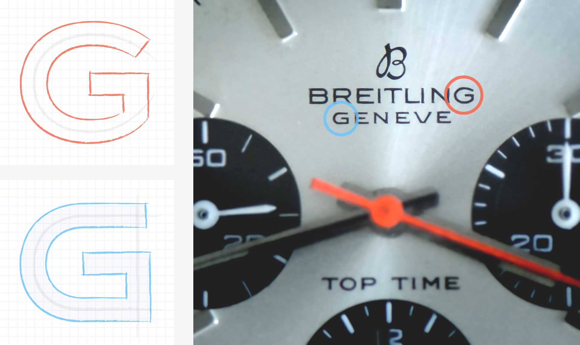
One of the charms of lettering is its inconsistency. Where a typeface is a fixed system designed to deploy in predictable ways, lettering has the flexibility to adapt to its circumstances. At the small scale of the wristwatch, these circumstances can be extreme: in this Brietling Top Time (ref. 810), the G on the top line has a curved construction, but the one below it — just 20% smaller — uses fully horizontal gestures to maintain an open aperture between the two nearby strokes. The dogged type designer may be left to choose between these two models, or to conclude that this beloved aesthetic is the product of these differences, and that no single alphabet could possibly deliver the attractive diversity of the vintage watch. For Decimal, we tried a third approach.

Instead of trying to reproduce the anarchic (and sometimes impractical) letters from actual watches, Decimal dissects the style into discrete themes, reassembling them in a different but more useful order. In the Breitling watch above, each model of letter G has its own merit: one is welcoming in its roundness, the other fierce in its geometry. Decimal applies these ideas in different places, so that they become less discordant, and more widely applicable throughout the typeface. In Decimal, open-armed roundness is evoked by curving the letter’s jaw, intensity by shearing its top stroke at a dramatic angle that ends in a sharp point. These decisions point the way to resolving the letter S (often awkward on watch dials), and the letter Q (generally absent.)
Wherever they could be employed consistently, and harnessed to serve a range of ten weights, idiosyncratic details have been retained, from the J with its unexpected serif, to the wide plateau on the A. The vestigial serifs on watch dials, never appearing with much consistency, are referenced in the angled arms of letters like E, reified into a subtle but perceptible motif that recurs throughout the design.
About the Name
The word ‘Decimal’ has recurred throughout horological history. Decimal Time refers to an invention of the French Revolution, in which the project of revising the calendar to feature a ten-day week was expanded to include a ten-hour clock, composed of one hundred ‘decimal minutes,’ each with one hundred ‘decimal seconds’ — a well-intentioned but short-lived experiment. Decimal watches are those that feature an additional chapter ring divided into hundredths, making it easier to measure minutes or seconds in more mathematically relevant units: “2.5 minutes” instead of “two minutes and thirty seconds” was a boon to scientists, aviators, and statisticians, if not bakers and athletic coaches as well. The idea of the decimal watch appealed to me as a piece of simple technology, and resonated with the themes of the typeface: here is an additional system, designed not to supplant what’s useful and recognized, but to supplement it with a new and valuable way of looking at the familiar. —JH


